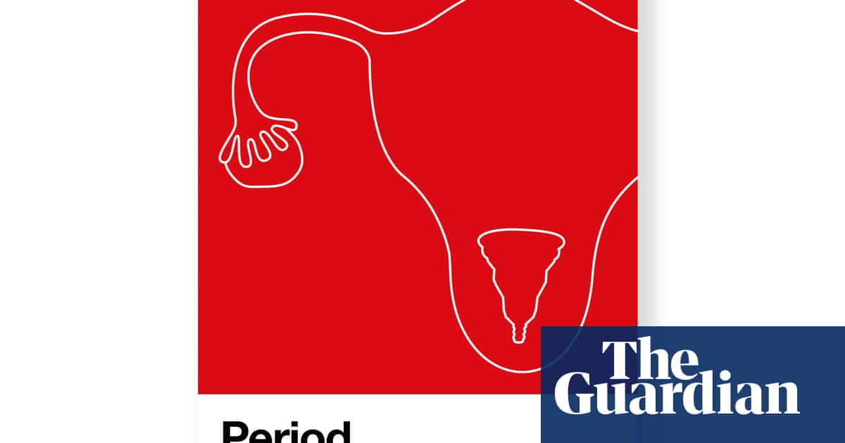
Pantone has unveiled a new shade of red inspired by the colour of women’s periods, as part of a new campaign to end the stigma associated with menstruation.
The company, which has the biggest colour matching system in the world, relied on by the global design industry, from graphic design to fashion, product design to printing, said the new shade was “an active and adventurous red hue” that it hoped would “embolden people who menstruate to feel proud of who they are”.
Pantone has teamed up with the Swedish feminine products brand Intimina to devise the new colour fronting its Seen+Heard campaign, which aims to empower and encourage people, regardless of gender, to talk in more detail about menstruation. Intimina said the colour was an “original shade of red that represents a steady flow”.
The Pantone system was devised in 1963 in the US to solve the problem of complicated colour matching in the printing industry. Its eponymous swatch book now has a spectrum of 2,625 colours and an enthusiastic following on Instagram.
Laurie Pressman, vice-president of the Pantone Color Institute, said: “An active and adventurous red hue, ‘period’ emboldens people who menstruate to feel proud of who they are. To own their period with self-assurance; to stand up and passionately celebrate the exciting and powerful life force they are born with; to urge everyone regardless of gender to feel comfortable to talk spontaneously and openly about this pure and natural bodily function.”
To highlight the new campaign, Intimina has made a donation to ActionAid, a charity working with women and girls living in poverty.
Jillian Popkins, ActionAid UK’s director of policy, said: “Around the world today, millions of women and girls still suffer due to the stigma associated with periods. Many girls miss vital days of school, or even drop out altogether, which is one reason so many women experience life-long poverty globally. Without the stigma around periods, more women could escape poverty, fulfil their potential and strengthen their communities. This important campaign will help change that.”
Some of the world’s biggest brands have launched high-profile trademark battles to protect their rights to use Pantone’s strictly classified colours. Last year Mondelēz, owner of Cadbury, dropped its long-running battle to have the exclusive right to use the distinctive colour purple (Pantone 2685c) after a court tussle with its rival Nestlé.
Every year Pantone names a “colour of the year” to reflect the mood of the times; 2020 was classic blue – although that was announced before the outbreak of coronavirus.
The Link LonkSeptember 29, 2020 at 09:59PM
https://www.theguardian.com/society/2020/sep/29/pantone-launches-new-shade-of-red-to-end-menstruation-stigma
Pantone launches new shade of red to end menstruation stigma - The Guardian
https://news.google.com/search?q=Red&hl=en-US&gl=US&ceid=US:en

No comments:
Post a Comment